General Assembly UX Design Course
Final project | Be Seen: A community to buy and sell secondhand plus-size clothing
Date:
April 2020
Position:
Student
Programs Used:
Figma, Miro, Maze, Procreate, Notion, Notability, Photoshop, Illustrator, Google Docs, Sheets and Slides, Pen, Paper
Shopping Is An Emotional Journey
My goal was to build a platform for plus-size women to buy and resell clothing; few labels and designers cater to them while making them feel like the desired target audience.

*Source: The International Journal of Fashion Design, Technology, and Education
Reselling Clothing Is An Exhausting Time Suck

A user must photograph, write-up each item, and post the listings if they are using Poshmark, Instagram, or Facebook.

There are other avenues to sell clothing (eBay and ThreadUp); however, most do not allow you to target plus-size clothing.

Poshmark markets itself as an easy way to sell clothing; however, they have six ways for users to ‘help sell’ their clothing.
Searching For Insights
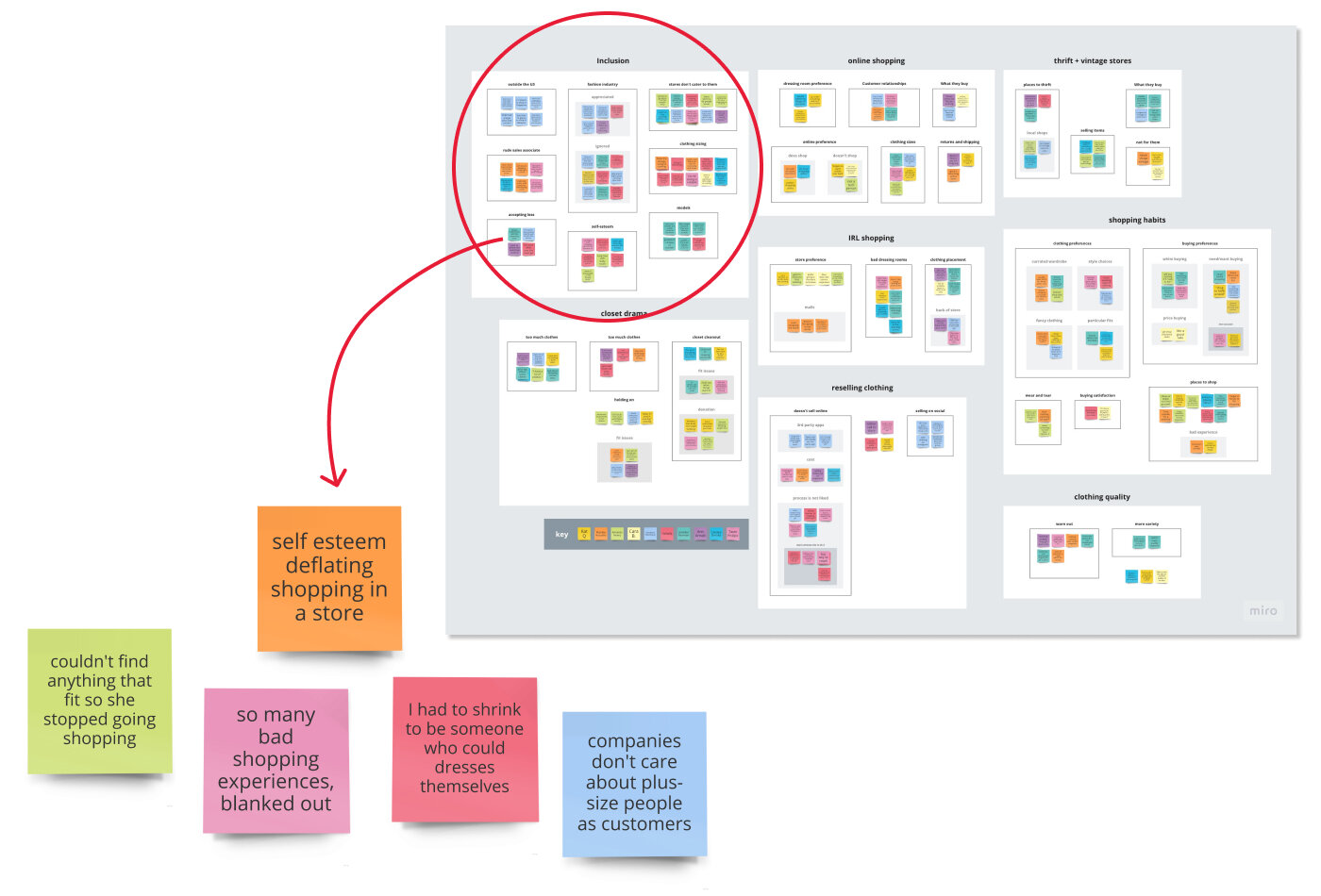
I asked interviewees about closet clean-outs, online shopping habits, their best and worst shopping experiences, and where they like to shop. I spoke with women from all walks of life to gain more insights. A new mother, an influencer, a plus-size shop owner in Singapore, and an everyday plus-size woman. Below are my five main takeaways:
They want to feel included and catered to by the fashion industry.
Women will pay more for quality clothing material.
They prefer shopping online and trying on clothes in the comfort of their homes,
Many trust Calvin Klein and Christian Siriano for attire.
Most don’t like using third-party apps because of a lack of time and dislike taking photos of each item.

Finding the Common Threads
It was how the women spoke of wanting to be valued by the fashion industry that struck me. The interviewees vocalized about hating their bodies, feeling unwelcome in stores, and wanting to feel embraced. I knew I needed to build a site that worked functionally in the UX space, but I also need to make sure the design made each user feel included. I wanted them to Be Seen.
“I’m 33 years old, practicing radical fat acceptance for my entire adult life, and I still can't walk into most stores and find clothes.”
— Ushshi Rahman, an influencer in the fat acceptance community, during our interview
What the women talked about resonated with me:
We can send a man to the moon, but we can't make clothing accessible for plus-size people?
This is a question Birdie Blankenship, my persona, would ask.
Meet Birdie Blankenship
Birdie is a Project Manager in Portland, OR, who practices body positivity and advocates fat acceptance. Growing up, she found that salespeople were rude and that most stores did not produce clothing in her size. Birdie now shops for labels and designers who embrace her in fashion.
The local thrift market didn’t take any of her clothes for reselling, making the trek not worth the time.
Birdie often finds plus-size apparel in the dark back corner or next to the maternity section in brick-and-mortar stores.
Birdie wants help selling clothing; she has not used third-party apps successfully.
She wants to feel included and catered to by the fashion industry.


Second Round of Sketches
Sketching It Out (analog and digital)
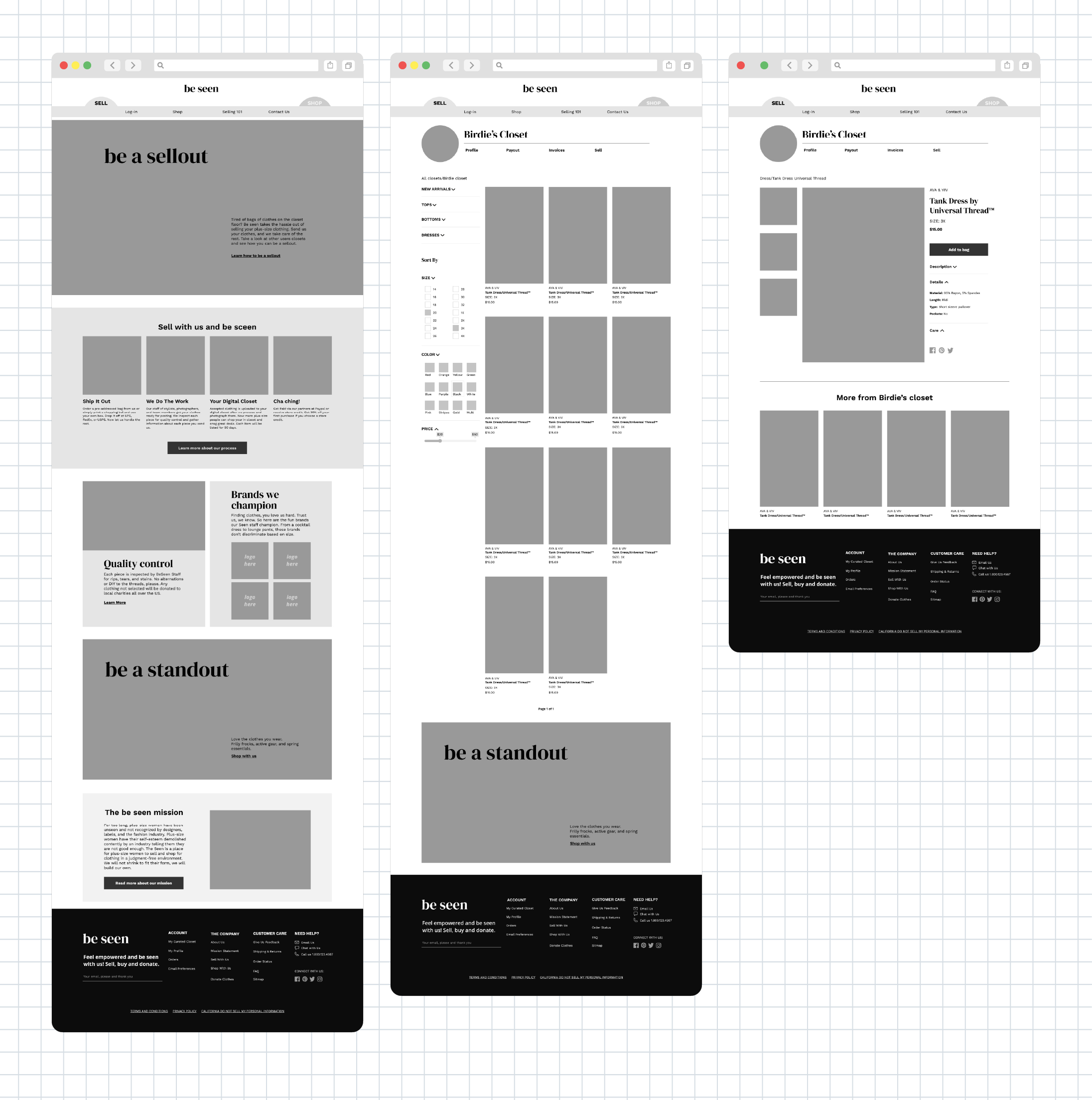
Be Seen is a buying and selling platform on a single website. The company does all of the time-consuming photography, posting, and uploading. I sketched a closet to house Birdie's "for sale" items and the Sell homepage, among other things. I made sure Sell and Shop were different yet felt like the same brand.


First Round of Sketches
Defining the Look
In wireframes, I updated the navigation to further differentiate between Sell and Shop.
A dual navigation bar allows two sites to become one.
I placed each on opposite ends of the navigation bar so they did not compete with one another.
The white space gives a distinct divide, leaving the rest of the navigation at the center.
Adding A Splash of Color…
I started to add color to the next set of wireframes to help define the Sell and Shop elements. The colors needed to be complementary yet distinct for the two sections. The navigation bar's “Buy with us” and “Sell with us” took on more space, ensuring they were a central focal point.

Tints of Sea-foam: “Sell with Us” navigation and section color


Tints of Orange Yellow: “Shop with Us” navigation and section color
…And Developing a Sense of Style

A Better Way to Search
I preformed one in-person test and received invaluable information. Beyond tweaking the language on buttons, I discovered I need to retool the "Shop" navigation bar.
Not being able to locate a gray hoodie annoyed the tester because a search bar was not prominent, and there was not a dropdown menu. Before the second round of Maze test, I added a new dropdown clothing menu and expanded search to the “Shop with Us” navigation bar.

The dual navigation bar was successfully used 100% of the time by Maze testers.
Evaluating The Mission
A teacher suggested I user-test the dual navigation. Using Maze, I set part of a mission to navigate from Sell to Shop. Results show that all 11 test-takers clicked on the “Shop with us” button to navigate between the two sites, proving the site’s dual website functionality is easy to navigate.
Being Seen in Good Light


Maze Tester Feedback:
“I really like the design. The pages look really well spaced, and like I would want to take a look around”
“Clean, fresh design and easy to see the mission and how to sell or buy. Would love to see something like this for real!”
“It looks super cute and friendly! It seems at first glance to be a place to sell clothing.”